World’s Most Famous Logos And The Stories Behind Them
A lot of logos we all recognize became famous because they were made by really creative people with big ideas and interesting stories. But what exactly makes a logo so popular worldwide?
Well, a successful logo is usually simple, memorable, and tells a story. Think about it like meeting a new friend. You remember them better if they have a cool story to tell and if they’re easy to recognize. The same goes for logos!
Even though things are always changing in the world, some things about making a good logo stay the same. Like, using the right fonts, colors, and designs can really make people like your brand.
Knowing the stories behind famous logos can help you make your own brand better and connect with the people you want to reach.
Furthermore, it’s important to remember that a lot of famous brands didn’t become famous right away. They had to keep trying and changing things until they got it right. But they never gave up, and that’s why they’re so successful now.
Top 10 Famous Logos And Their Stories
If you’re looking for ideas for your logo, check out these cool stories about 10 famous companies and their logos. You might get some good inspiration!
Each of these companies has a story behind their logo, like why they chose certain colors or shapes. Learning about them can help you think about what you want your logo to say about your own company.
1. Apple
Did you know that the famous Apple logo with a bite taken out of it has a simple but interesting story behind it?
Some people thought it was a tribute to a famous scientist, but actually, it’s not true. The founder of Apple, Steve Jobs just liked the word ‘Apple’ and was on a diet of only fruits when he came up with it.
The logo was made by a designer named Rob Janoff, who said he added the bite so people wouldn’t mistake it for a cherry. Sometimes, the simplest ideas can make the biggest impact!
![]()
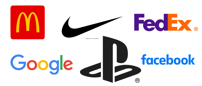
2. McDonald’s
The McDonald’s logo is super famous for a lot of reasons. It’s not just a sign for a fast-food place, it’s become a symbol of big ideas like global growth and American culture spreading around the world.
The logo has these big golden arches that look like the letter ‘M’. They were actually part of the first McDonald’s building way back in 1952, and they stuck around ever since.
The colors yellow and red were chosen on purpose. Red makes you feel energized, while yellow is all about happiness. Moreover, using yellow for the arches makes the logo really easy to spot, even on a busy street.
In addition, McDonald’s shows that the key to making a super famous logo is to keep it simple, use cool shapes and colors, and make sure people can recognize it right away.
![]()
3. Google
Google’s logo is super famous because everyone uses Google to search the internet!
It might look simple, but there’s a cool story behind it. The logo was first made by Larry Page in 1997, and since then, Google has changed it a bit, mostly just moving around the colors of the letters.
The colors in the logo are really important to Google. They wanted it to be recognizable all over the world, so they picked colors that are bright and easy to see. But they also wanted to show that they’re not like every other company, so they added a green letter ‘L’ to break the pattern.
By using red, blue, and yellow, which are the main colors on the color wheel, and adding that green ‘L,’ Google’s logo shows that they’re all about thinking differently and being creative.
![]()
4. Coca-Cola
The Coca-Cola logo is super famous and has been around for a long time. It hasn’t changed much since it was first made in 1887!
The guy who made Coca-Cola, Dr. John Pemberton, originally used kola nuts and cocaine in the drink. He thought it would make people feel better. Even though they don’t use those ingredients anymore, Coca-Cola still aims to make people feel good.
The name ‘Coca-Cola’ and the logo with the two big ‘C’s were thought up by Frank Robinson, who worked for Pemberton. At first, not many people were interested in Coca-Cola, but after Pemberton sold the company, it started to get popular.
The logo has stayed pretty much the same over the years, with the same style of writing and those big ‘C’s. They chose the color red for the brand because they needed to paint the bottles red to tell them apart from alcohol. Now, Coca-Cola uses a mix of red shades to make their logo stand out.
Even though Coca-Cola has changed a lot over the years, they’ve kept their logo the same to show respect for their history and traditions.
![]()
5. Nike
You might think Nike’s famous swoosh logo cost a fortune to make, but actually, it was created by a student for just $35!
Nike’s founder, Phil Knight, wanted a logo that showed movement and determination. He asked his student, Carolyn Davidson, to help. She came up with a few designs, and Knight liked the one with wings, inspired by the Greek goddess Nike.
That’s how the swoosh logo was born! Nike, named after the goddess of victory, liked the symbol’s fitting meaning. Even though Davidson was only paid $35 at first, her logo became super famous.
By 1983, Nike was a big sportswear brand, and they even gave Davidson shares in the company as a thank-you gift. Those shares are worth a lot now! So, even small projects can lead to big things, just like with Nike.
![]()
6. FedEx
The FedEx logo is super famous and even won an award! It’s known for a cool trick with negative space. If you look closely between the letters E and X, you’ll see a hidden arrow pointing right. That arrow shows FedEx’s mission to deliver fast and accurately.
But what’s really unique about the logo is its colors. The word ‘Fed’ is in purple, and ‘ex’ is in orange. Most brands don’t use these colors together, but for FedEx, it works perfectly.
The purple stands for the company’s promise to give customers a great experience, while the orange shows their commitment to diversity.
Together, purple and orange make FedEx stand out and show off its qualities of being successful and driven. It’s a logo that really stands apart from the rest!
![]()
7. Facebook
Facebook is the biggest social media site in the world, started from a dorm room at Harvard University. Even with all the ups and downs, its logo remains super famous, seen by billions of people every day.
The logo is just the word ‘Facebook’ in small letters. Why small? Well, it’s because Facebook wants to feel relaxed and friendly, like chatting with friends.
And the colors? They’re blue and white because Mark Zuckerberg, the founder is colorblind. Blue is the color he sees best, so that’s what they chose for the logo.
Simple, right? But it’s become one of the most recognizable logos out there.
![]()
8. PlayStation
PlayStation is the biggest video game company in the world, owned by Sony. Millions of people have PlayStation consoles at home, and now, with the Uncharted movie, the logo is even on the big screen.
The guy who made the PlayStation logo, Manabu Sakamoto, tried lots of designs before picking the final one for the PlayStation 1. He used red, green, blue, and yellow to keep it simple and easy to understand.
The original logo had a cool trick with the letters P and S, making it look like they had depth, like 3D games. That was pretty cool for something made in 1994!
Even though the colors have changed, the PlayStation logo is still the same shape in black and white. Over the years, it’s become one of the most famous logos in gaming and beyond.
![]()
9. The Rolling Stones
The Rolling Stones are super famous for their awesome music that mixes rock and blues. They’ve been around since 1962 and are still going strong!
Their logo, with the tongue sticking out, is one of the most famous logos ever. It’s actually inspired by the Hindu goddess Kali, who symbolizes feminine power.
The tongue sticking out is all about rebellion and going against the norm, which is what the band is all about. The designer, John Pasche, only got paid £50 for it, but it made him really famous.
So, the Rolling Stones logo is not just cool-looking, but it also has a deep meaning behind it.
![]()
10. Penguin Books
Penguin Books has been giving us great reads since 1935, with everything from classic literature to modern hits. And they’re famous for their logo, which has appeared in lots of TV shows and movies.
The logo was first sketched by a guy named Edward Young at the London Zoo in the 1930s. He wanted it to be fun but still realistic.
Even though the logo has been tweaked a bit over the years, it still looks a lot like the original. That just shows how good Edward’s design was.
Penguin Books liked their bird logo so much that they used it for other stuff too, like Pelican Books. So next time you see a cute bird logo on a book, you know who to thank!
![]()
Let’s Sum Up
Looking for a logo that captures the essence of your brand and tells a story just like these famous logos? Look no further than LogoLeagues! Our expert designers are passionate about creating memorable and impactful logos that reflect your vision and connect with your audience. Whether you’re a startup looking to make a splash or an established brand in need of a refresh, our logo design services are here to help you stand out from the crowd. Contact us today and let’s bring your logo ideas to life!