Logo Colour Combinations To Inspire Your Next Logo Design
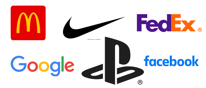
Have you ever noticed how certain colors instantly remind you of your favorite brands? Like when you think of Starbucks, you picture that green and white logo, right? Well, our brains are wired to notice and remember these color combos!
But picking the perfect colors for your brand isn’t just guesswork. There’s actually a science behind it called a color theory. It helps you choose colors that work well together and leave a lasting impression on your customers.
So whenever you’re deciding your brand’s colors, remember that there’s a whole world of color theory to guide you!
Types Of Color Combinations
When you’re picking colors for your logo, it helps to think about how they work together on a color wheel. Imagine a circle with red, yellow, and orange on one side (those are the warm colors), and blue, green, and purple on the other (those are the cool ones).
Knowing how these colors relate to each other on the wheel is super important for making your design look great. So, whether you’re going for a warm, cool, and calm color for your logo, the color wheel can help you find the perfect combination!
Complementary Color
These are colors that are opposite each other on the color wheel, like red and green or blue and orange. When used together, they create a strong contrast and make your brand design really stand out.
Analogous Color
These are colors that are next to each other on the color wheel, like blue, green, and teal. Using these colors together gives your design a natural, balanced feel, just like you’d see in nature.
Triadic Colour
Imagine drawing a triangle on the color wheel, connecting three equally spaced colors, like red, yellow, and blue. Using these three colors together makes for a vibrant and dynamic color palette that really pops.
We’ve picked out some awesome color combos (and a bit of color psychology) to get your creative juices flowing for your next logo! Let’s check them out!
16 Logo Colour Combinations For Unique Designs
Check out these 16 cool logo color combos paired with design ideas!
1. Royal Purple And Periwinkle
This combo feels royal and calming. The deep royal purple stands out against the soft periwinkle, mixing intensity with peace. It’s a balance of richness and tranquility, perfect for beauty and fashion brands going for sophistication and serenity.
2. Neons On Black
Neon green and violet on a black background make a bold and modern statement. It’s visually striking and gives off an edgy vibe. Neon colors are popular right now, and this combo is perfect for entertainment, fashion, or any industry where you want to stand out with unique branding.
3. Blazing Orange And Mahogany
This combo brings warmth and energy. The bright blazing orange pops against the deep mahogany, perfect for modern industries like marketing or food and beverage. It gives off a strong, rich, and luxurious vibe!
4. Tea Green And Moss
This combo brings the calmness of nature into your logo. Tea green, with its soft touch, pairs nicely with the deeper, earthy moss color. Monochromatic logos are in trend, giving your design a fresh and grounded look.
5. Purple And Yellow
Want your logo to radiate wisdom? Combine the bright, energizing yellow with the rich purple to inspire creativity. This classic complementary duo is popular in the restaurant and education sectors, inducing feelings of optimism and intellect.
6. Blue And Turquoise
For a logo that screams intelligence, confidence, and trust, go for blue and turquoise. They’re close in color but different enough to stand out together, especially if you use turquoise sparingly. Bright teal can make your design really pop, especially when paired with a darker, muted color.
7. Black And Yellow
Black and yellow make a great pair, complementing each other nicely. The bright yellow brings energy and joy. The almost-black gray adds a touch of mystery, often seen in the entertainment industry, like nightclubs.
8. Red, Navy, And Yellow
Feeling daring? Try this dynamic trio of colors! The vibrant red pairs perfectly with the cheerful yellow and sophisticated navy, giving off a sense of power and confidence. Use this bold color combination for an entertainment or restaurant brand to make a strong statement.
9. Purple And Pink
Looking for warmth, fun, and ambition all in one? The lively pink adds a burst of energy, while the purple brings a sense of maturity. This color combo is often found in beauty and blogging industries, giving off a playful yet professional vibe.
10. Fuschia And Neon Green
Check out this trendy combo! Mixing cyberpunk style with neon green and fuchsia, this logo demands attention. Pink and green complement each other perfectly (they’re complementary colors, after all), and these intense shades bring the excitement, just like a high-energy spin class.
11. Blue And Green
While blue and green usually bring a sense of calm, this electric blue and lime green combo brings energy and youthfulness. It’s vibrant and lively, perfect for fashion, media, and entertainment industries that want to make a bold statement.
12. Lipstick Red And White
This color duo is bold and attention-grabbing! Red is lively and exciting, especially in a vibrant shade like lipstick red. Pairing it with white, a calm and neutral color, creates a striking contrast. It’s ideal for team logos and retail spaces that want to stand out.
13. Teal And Coral
Teal and coral together bring a playful and creative touch to your logo. They’re bright and cheerful without being overpowering. This color scheme works well for creative consultants and education-based businesses, adding a fun vibe to your brand.
14. Light Purple, Mint, And Butter
This logo rocks a triadic color scheme for a soft yet lively vibe. Lavender purple pairs perfectly with buttery yellow, and a touch of mint green add that extra pizzazz. It’s like a breath of fresh air with its spring-inspired pastel color!
15. Teal And Lavender
This palette might seem unexpected, but teal and purple make magic together, especially when one color takes the lead. Here, soft lavender creates a striking contrast against a darker background.
16. Blue And Pink
Looking for a logo that’s both professional and friendly? Consider a navy and hot pink combo. The vibrant pink stands out against the blue backdrop, making it perfect for industries like beauty and blogging where you want to make a statement.
Conclusion
Coming up with the perfect color for your logo might not happen right away. It’s unrealistic to nail it on your first try. Even experienced designers spend days or weeks experimenting with different color combinations for their designs. The impact of color is hard to describe, so spending time on this part of the design process pays off in the end.
Choosing the right color combinations for your logo is both work and fun. Try out different colors and mixes to find the perfect palette, and don’t forget to look to other brands in your industry for inspiration or ask for feedback.
If you are looking for the top logo designers in the US, offering quality at affordable prices, we recommend you to consider logo leagues.
Tip: One effective way to figure out which color should be in your palette is to let our designers match them to your brand personality and logo design scheme.